Braiding Nairobi
Mobile App + Web App
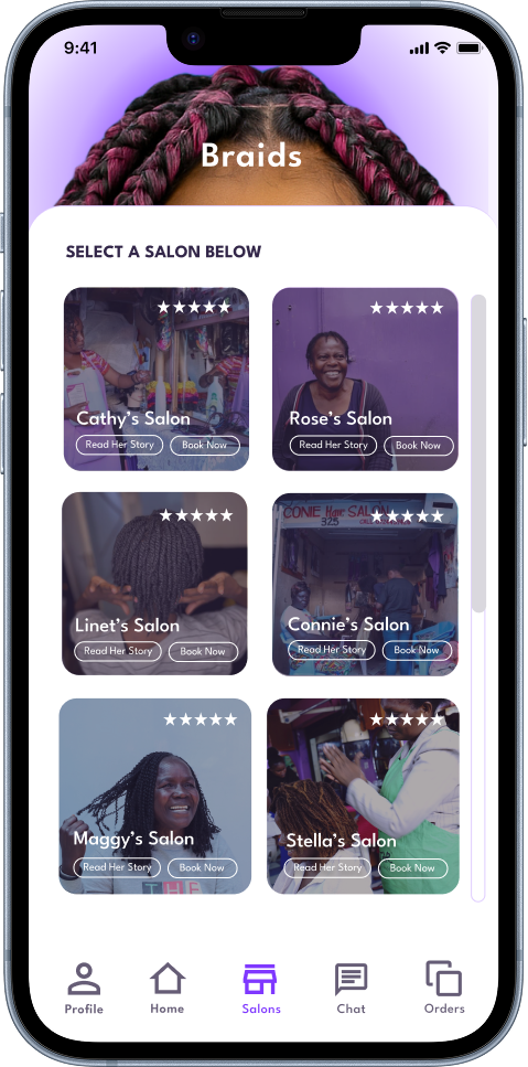
The Braiding Nairobi App connects clients with professional hair braiders in Nairobi, offering convenient at-home styling and easy appointment booking.
The Braiding Nairobi App connects clients with professional hair braiders in Nairobi, offering convenient at-home styling and easy appointment booking.
Customers
Sign-ups
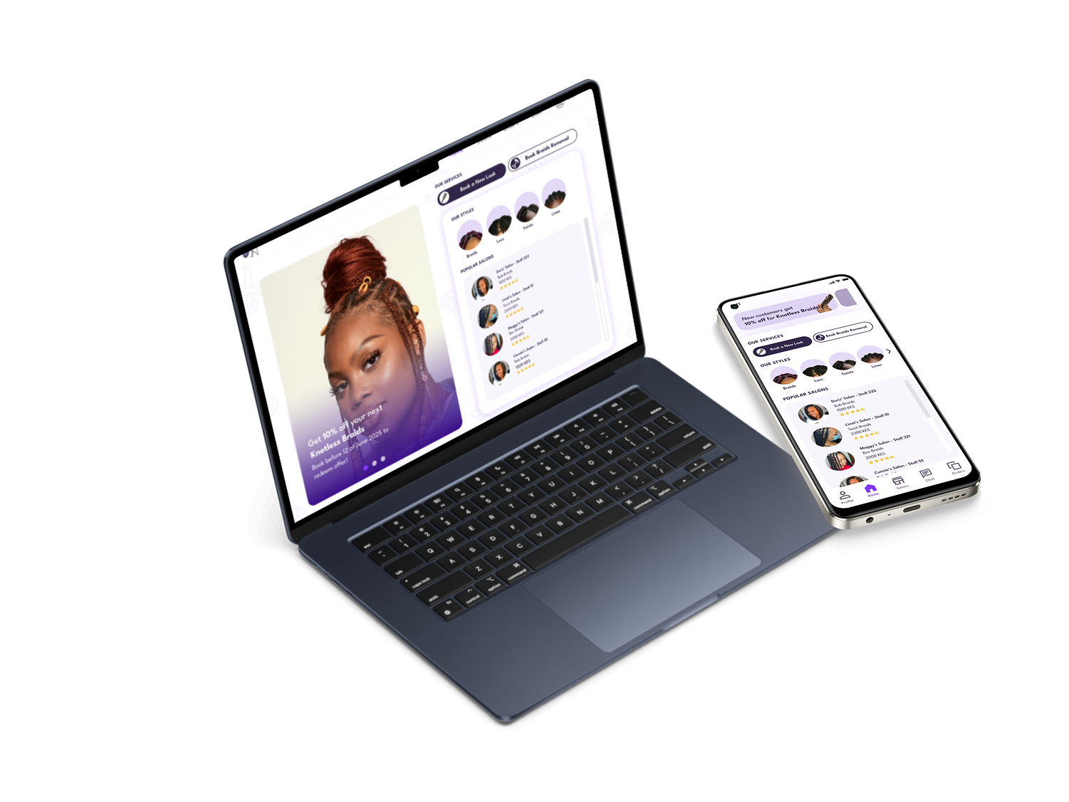
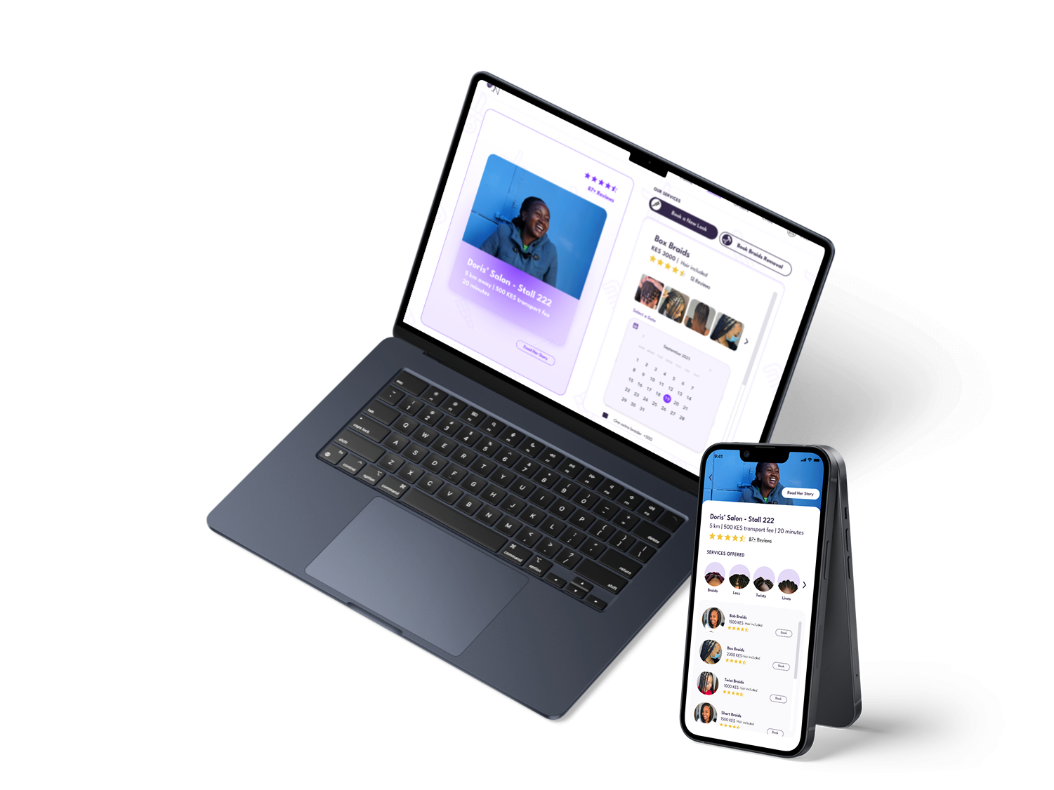
Salons
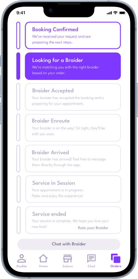
Orders
As Acting CPTO at Braiding Nairobi, I lead both product design and front-end development for an active web and mobile platform. This role bridges design strategy, UX research, and code implementation, allowing me to craft a cohesive user experience while improving technical performance.
The project demonstrates how I integrate design thinking with engineering to deliver scalable, user-centered digital products.
I follow an iterative approach combining continuous discovery and delivery. Each cycle begins with research and data analysis, followed by ideation, prototyping, and front-end implementation. This feedback loop allows for rapid testing and real-time design validation within production, creating a tighter relationship between UX and development.

Analyze user data, conduct interviews, and identify friction points to inform design decisions.
Create prototypes, design systems, and interactive mockups in Figma for validation.
Implement features using Flutter, translating designs into production-ready components.
Validate usability, accessibility and performance with real users and analytics.
Refine features based on feedback, completing the cycle and starting again.
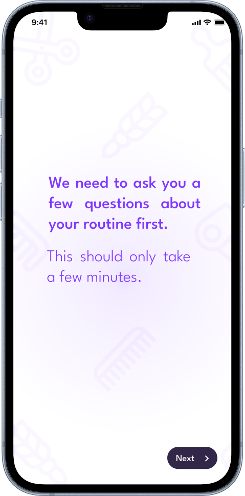
Through booking-flow analysis and user feedback, I identified friction points in the onboarding and appointment process. This research highlighted opportunities to simplify navigation, clarify service information, and make booking more intuitive across web and mobile. Insights from this phase informed the redesign strategy and prioritization of high-impact features.
I conducted a comprehensive UX and technical audit to assess usability, performance, and design consistency. This included reviewing color contrast, typography, accessibility standards (WCAG), and component hierarchy.
Key improvements include:


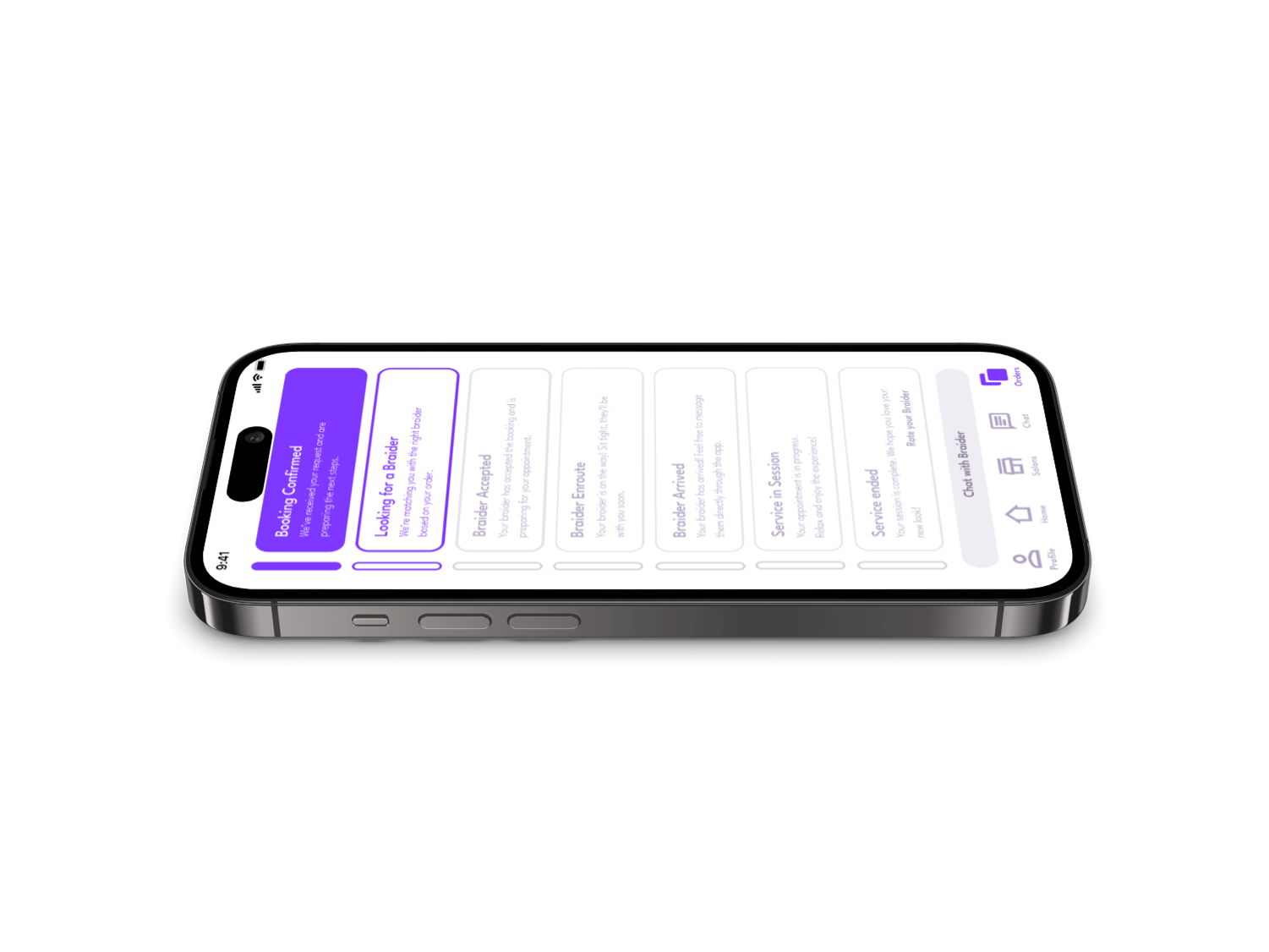
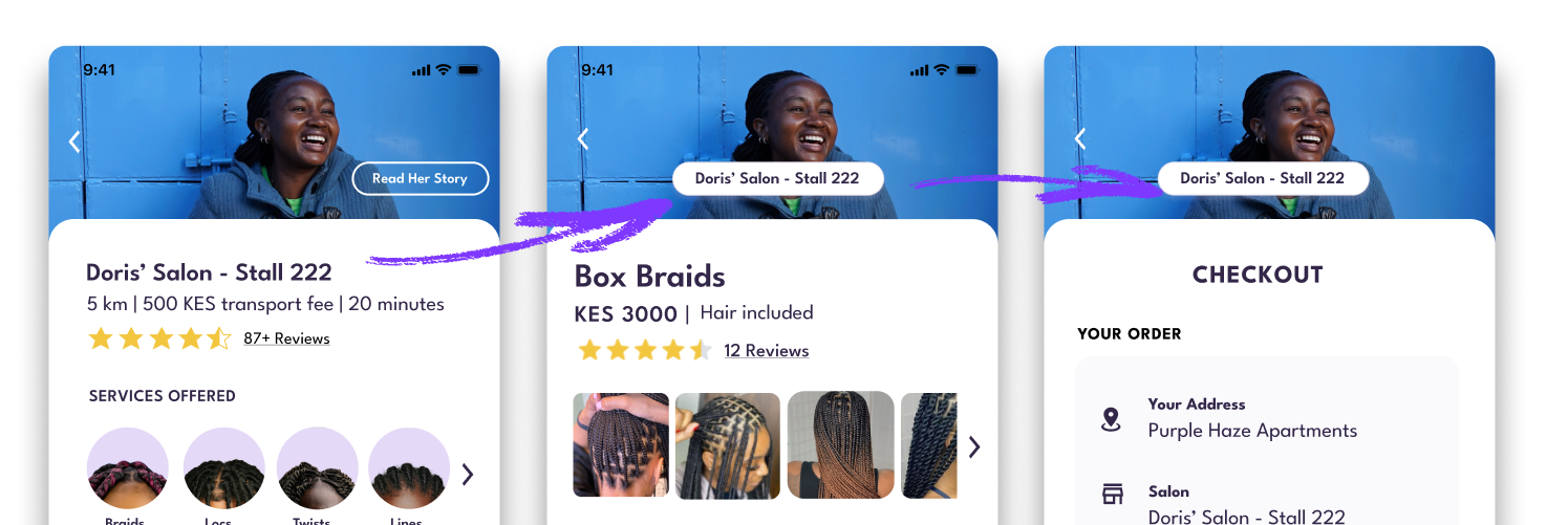
The redesigned web app emphasizes simplicity and accessibility. Each screen was crafted to improve discoverability, speed, and user confidence. For instance, the booking dashboard now provides immediate visual feedback on appointment status, reducing confusion and drop-offs.
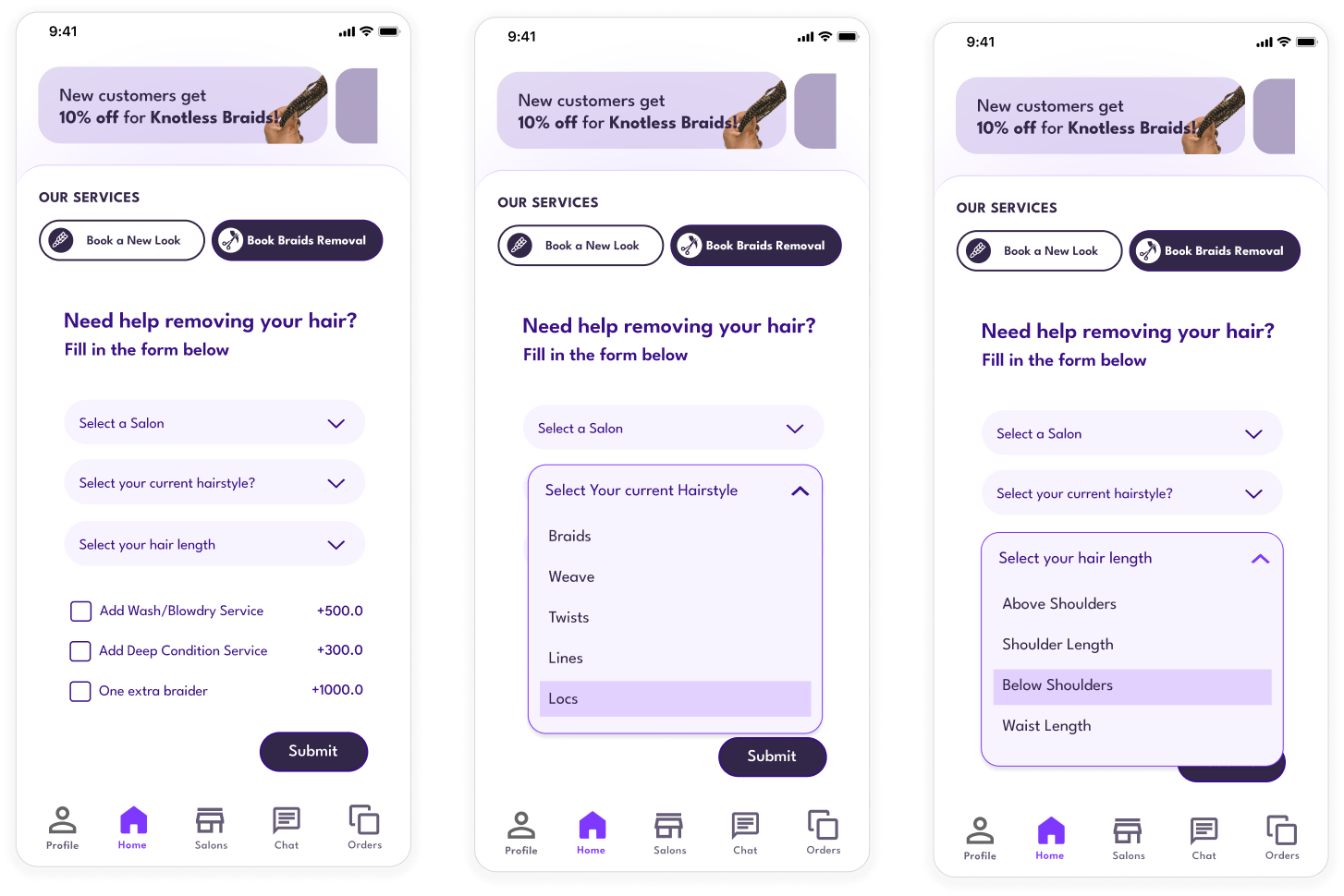
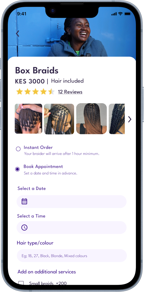
I introduced a "Repair & Touch-Up" booking option to make it easier for users to schedule quick hair fixes between full braiding sessions.
An A/B test would compare the current app (Group A) with the new feature (Group B), measuring repeat bookings and app engagement. The hypothesis: increased convenience will improve retention, with insights guiding future iterations
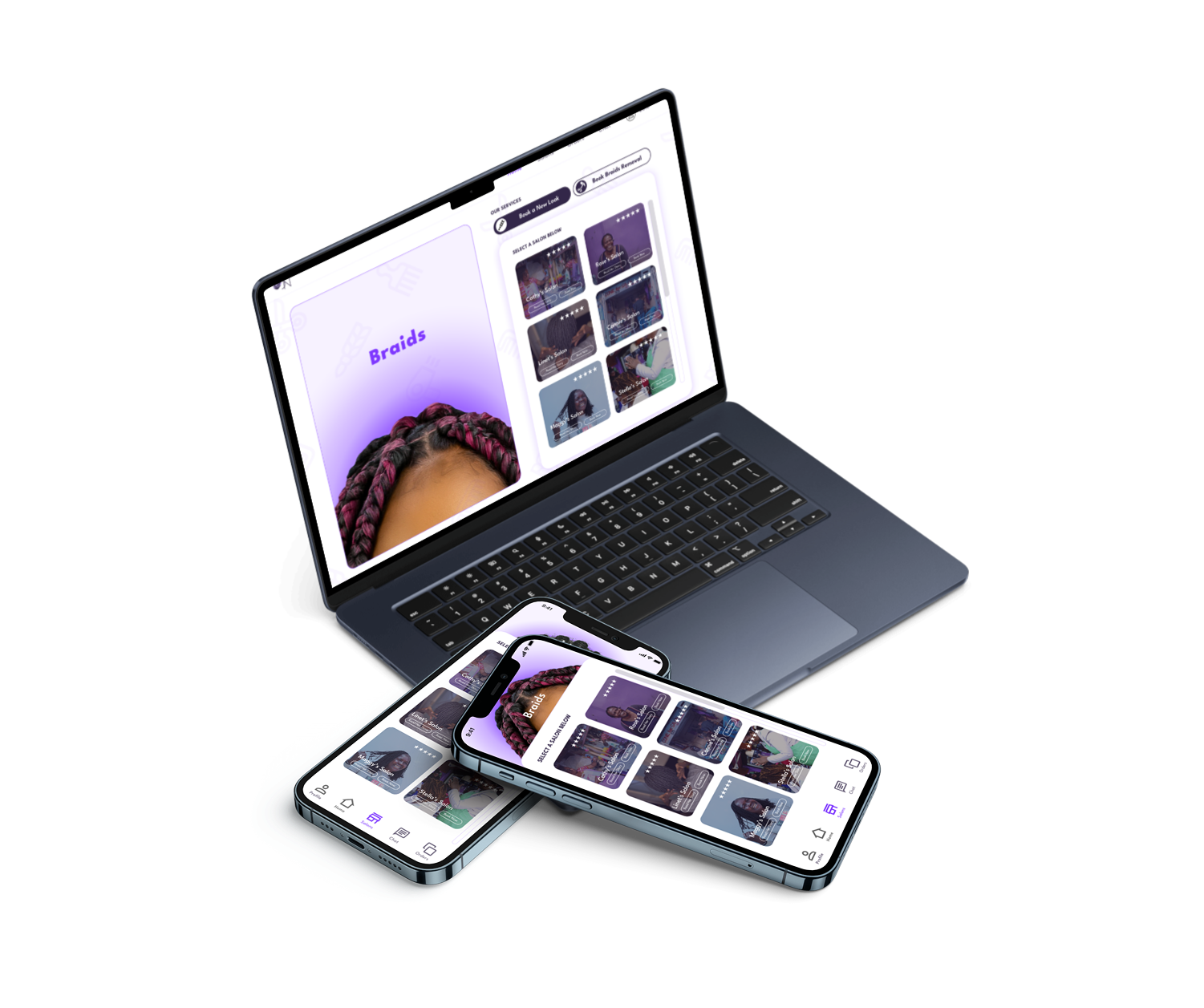
The app is responsive and works on all devices, including mobile, tablet and desktop. Though we started with the design of the mobile, we made sure that on smaller screens on web, the mobile app layout would be the same.
After running user tests and a full technical audit, we found a few areas that needed improvement to make the booking experience clearer and smoother. The audit also highlighted a few usability tweaks, things like making error messages clearer, keeping the salon name visible through the entire booking flow, and optimising images and search to make the app faster and easier to use.

Some users weren't sure what to expect when booking instantly, so I added a disclaimer at the point of booking to set expectations upfront.
These updates are part of an ongoing effort to take in real feedback, from both users and the team, and turn it into meaningful changes that make the product feel more intuitive and reliable.
This ongoing project reflects my approach as a hybrid designer-developer, combining product strategy, UX design, and front-end execution to deliver meaningful, data-driven user experiences. As the platform continues to evolve, I remain focused on scaling usability, accessibility, and design consistency for real users.